Mobile-Responsive Web Design Services
$336.00
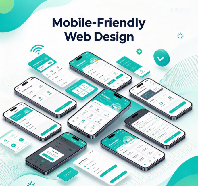
Focused on mobile-first adaptation, we optimize page layouts, button sizing, and typography specifically for smartphone screens. We implement touch-friendly interactions and simplify mobile workflows, ensuring all page elements automatically adjust to fit any mobile display. This guarantees a smooth, comfortable browsing experience on mobile devices, resolving common issues like lag or broken layouts, and significantly improving the experience for your mobile visitors.